
Have you ever walked into a room and immediately felt more relaxed—or, on the flip side, super energized? That’s not just good design at play. It’s color psychology in action.
Colors do more than just look good on your walls—they actually influence how you feel. From calming blues to invigorating yellows, each hue carries its own mood. And when you match the right color with the right room, your space can become more aligned with the way you want to feel in it.
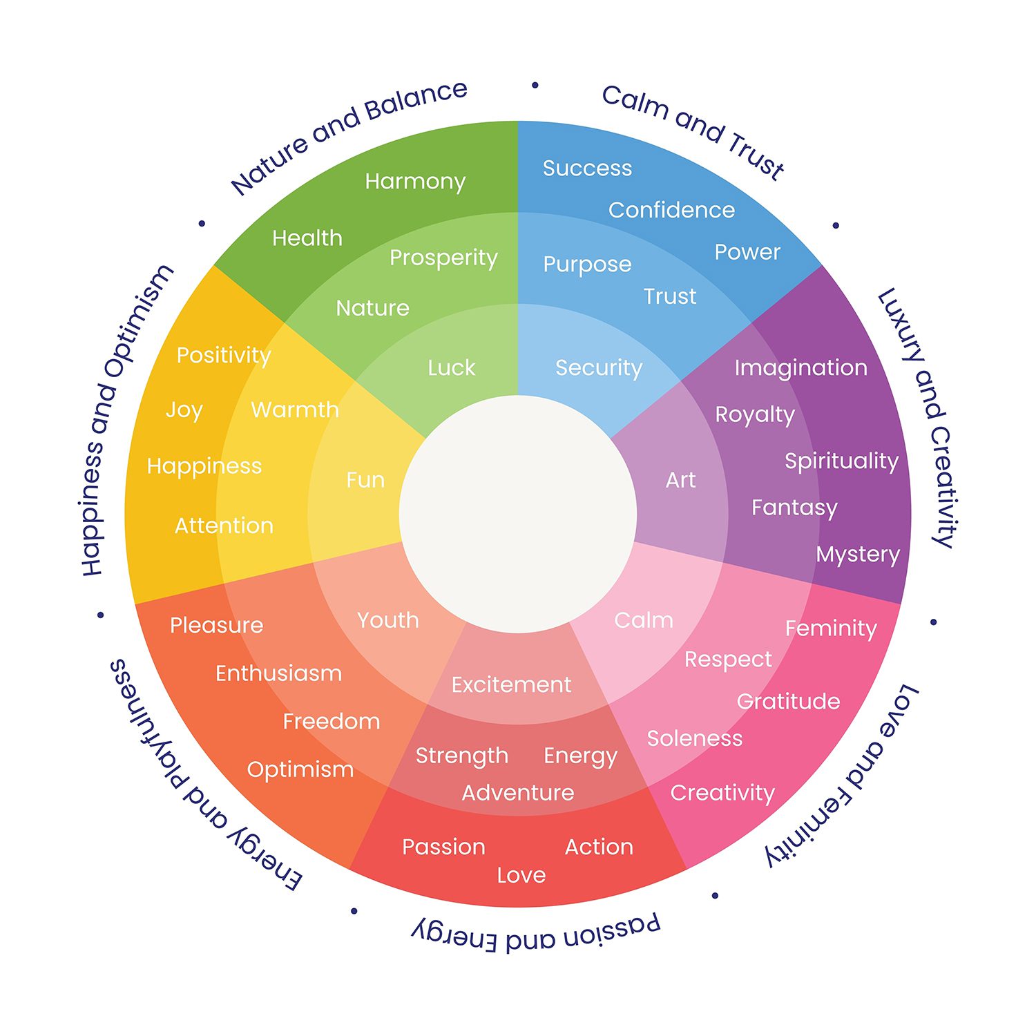
Color and Mood: What’s the Connection?
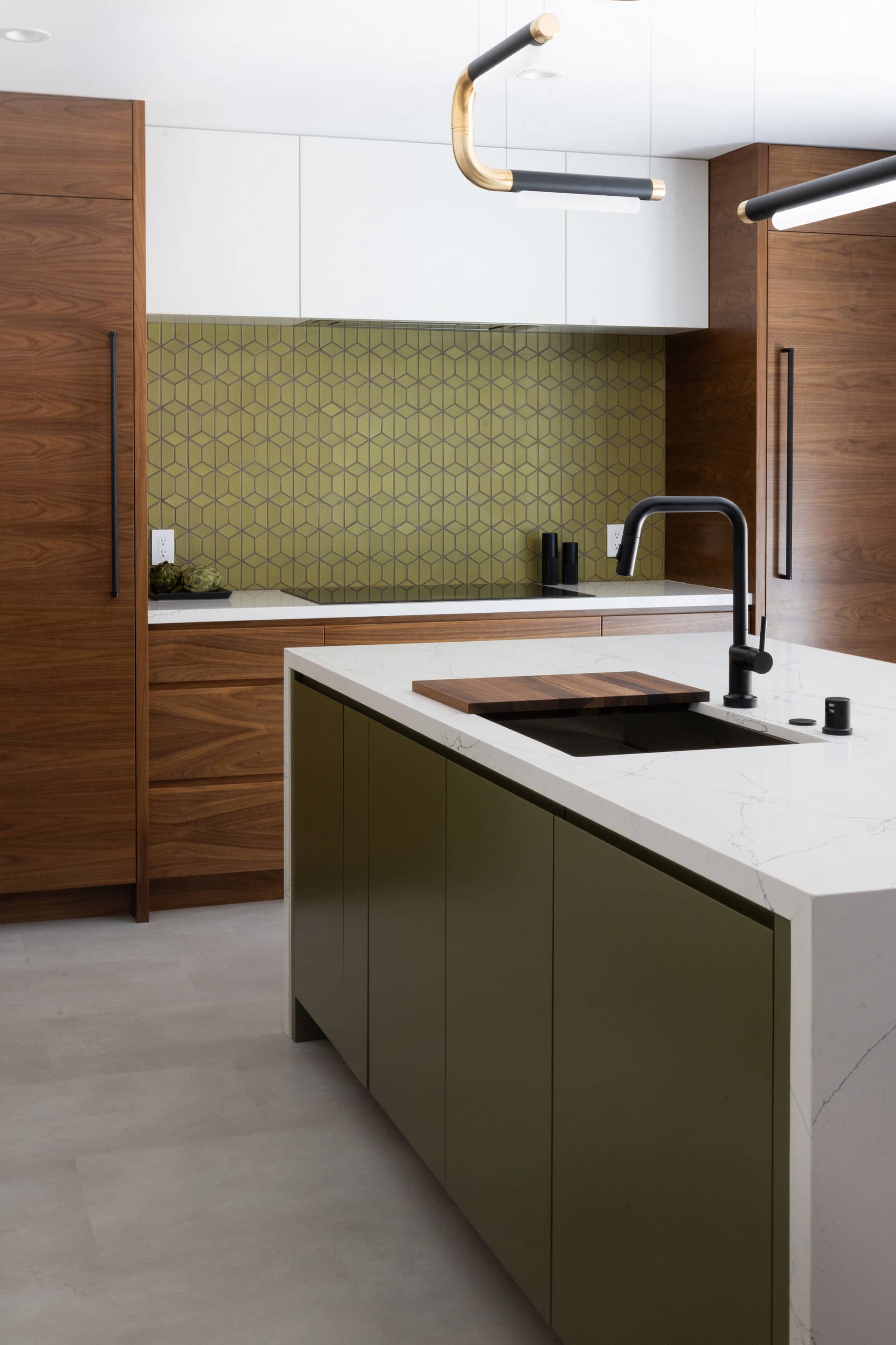
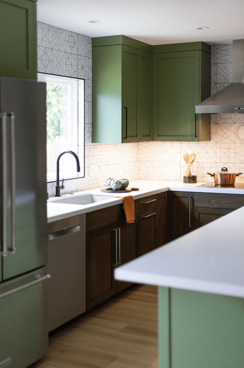
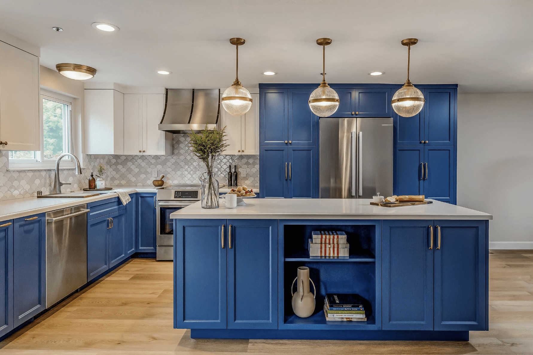
Here’s the scoop: our brains respond to color in powerful ways. Soft, muted tones like pale blue, sage green, or warm beige can create a soothing atmosphere—perfect for bedrooms or cozy reading nooks. On the other hand, bold colors like red, orange, or even a punchy yellow can energize a space, making them great for kitchens, creative studios, or home gyms.
The Psychology Behind Colors
Color psychology explores how different hues affect human mood and behavior. For instance, warm colors like red and yellow are associated with energy and excitement, while cool colors like blue and green promote calmness and relaxation.
Moreover, the tonal value (lightness or darkness) and saturation of colors significantly impact mood and ambiance. Lighter, saturated colors are linked to positive emotions, while darker, desaturated colors can evoke more subdued feelings.
Choose with Purpose
The key is to think about how you use each room and what kind of energy you want it to give off. For example:
Living room: Want it to feel welcoming and warm? Earthy tones and warm neutrals can create that inviting vibe.
Home office: Need a space that boosts focus and productivity? Try cooler tones like light gray, blue, or even a touch of green to keep things calm but not sleepy.
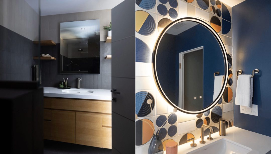
Bedroom: This is your retreat. Soft hues like lavender, dusty rose, or calming blue can help create a peaceful, restful space.
It’s All About Intentional Design
When you choose colors intentionally, you’re not just decorating—you’re shaping the way your home feels and functions. Whether you’re planning a full makeover or just adding a new accent wall, a thoughtful color choice can make a big impact.
Applying the ’60-30-10′ Rule
A helpful guideline for establishing a color palette in your space is the ’60-30-10′ rule:
- 60%: Dominant color (e.g., walls)
- 30%: Secondary color (e.g., upholstery)
- 10%: Accent color (e.g., accessories)
Ready to Refresh?
If your space isn’t quite reflecting the vibe you’re going for, maybe it’s time to give it a little color refresh. With just a few thoughtful changes, you can turn any room into a space that truly feels like you. If you need help with ideas for your remodel, don’t hesitate to get in touch with the Next Stage team.